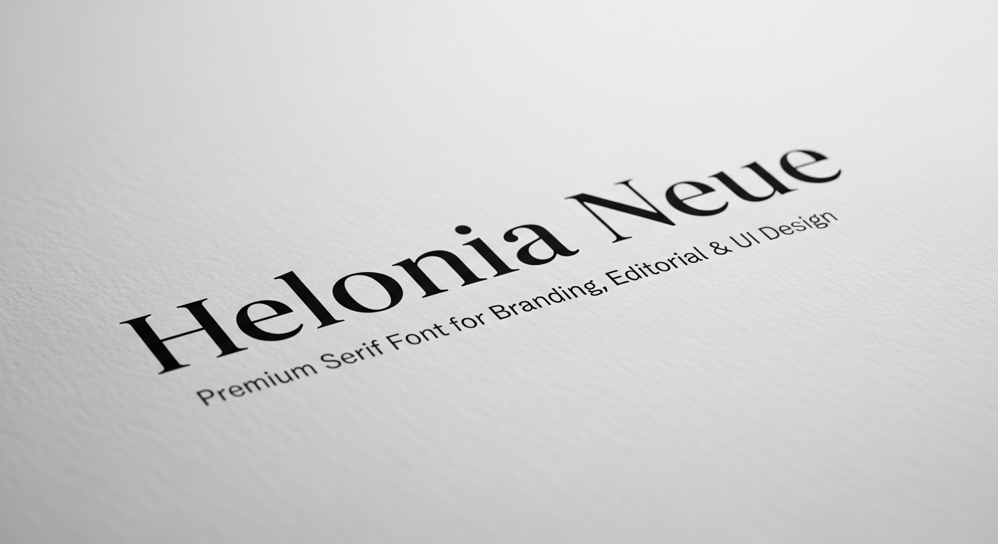
That’s why Helonia Neue is showing up in brand identity systems, editorial templates, and increasingly, UI design — especially where designers want a “premium” feel without sacrificing usability. Many designers describe it as a modern serif designed to balance elegance with practical readability and versatility.
What is Helonia Neue?
Helonia Neue is commonly described as a modern serif typeface created to deliver a premium, contemporary look that still performs in real-world layouts — logos, packaging, magazine spreads, landing pages, and UI components.
In plain terms, Helonia Neue aims to give you:
A refined serif personality for “brand voice.”
Enough restraint to avoid looking overly decorative.
A clean structure that works with grids, spacing systems, and responsive design.
That mix is exactly why modern serif fonts are trending again: they can feel more distinctive than default sans-serifs, yet still look current in digital-first brands.
Helonia Neue is a modern serif font used for premium branding, editorial typography, and digital design systems where designers want elegance with strong readability.
Why a premium serif font matters for branding
Fonts aren’t decoration; they’re a brand behavior. Typography influences perceived credibility, trust, and personality — especially in sectors like beauty, fashion, finance, hospitality, and premium SaaS.
Research and reviews of legibility and perception consistently emphasize that readability and preference depend on multiple factors beyond “serif vs sans,” including stroke contrast, spacing, and context.
So when designers call a font “premium,” they usually mean some combination of:
High-quality letterforms that hold up under scrutiny.
Consistent spacing and rhythm across weights and sizes.
A distinctive, ownable tone that doesn’t feel generic.
Versatility across print and screen without falling apart.
In branding, Helonia Neue can help you land that “crafted but modern” feeling — especially when paired with a clean sans for UI text or supporting copy.
Helonia Neue for branding design systems
Logo and wordmark use
For logos, the goal is rarely “maximum readability at 12px.” The goal is recognizability, uniqueness, and tone. Helonia Neue’s modern serif vibe can bring instant personality to a wordmark, particularly if you:
Use a tighter optical size (larger than body text).
Adjust kerning manually around tricky pairs (like A/V, T/o, W/a).
Test on real brand contexts: favicon, app icon lockups, packaging, signage.
Scenario: A boutique skincare brand wants to look clinical and luxurious. Helonia Neue in the wordmark gives heritage and refinement, while a neutral sans-serif handles ingredients, instructions, and UI labels.
Packaging and premium retail
Modern serif fonts often do heavy lifting on packaging because they communicate craft and confidence quickly. In packaging layouts, Helonia Neue tends to perform best when you:
Keep hierarchy simple (one hero line, one supporting style).
Use generous whitespace so the serif details can breathe.
Avoid crowding it with overly ornate scripts or textured backgrounds.
Helonia Neue in editorial and publishing
Editorial design is where a modern serif can truly flex. The job here is atmosphere + readability + hierarchy, all at once.
Headlines and display typography
For magazine-style layouts, Helonia Neue can serve as a headline serif that feels current rather than classical. To make it feel expensive (not fussy), lean into:
Strong contrast between headline and deck copy.
Tight but not cramped line spacing for headlines.
Consistent column rhythm and baseline grid alignment.
Recommended image (with alt text): Image alt: “Helonia Neue used in an editorial headline with modern grid layout”
Body text considerations
Serifs can read beautifully in print. On screens, performance depends on rendering, size, and spacing. Large studies and reviews note that screen legibility is influenced by device resolution, stroke contrast, and typeface-specific design — not just whether serifs exist.
If you use Helonia Neue for long-form reading on the web:
Start body sizes slightly larger than you would with a minimalist sans.
Increase line-height to reduce visual density.
Check hinting/variable rendering if available, and test across browsers.
Helonia Neue for UI design: how to keep it usable
Using a serif in UI can be stunning — if you respect the constraints. UI typography needs clarity at small sizes, predictable spacing, and consistency across states.
Where Helonia Neue works best in UI
Think “expressive accent,” not “everything everywhere.”
Hero headings on marketing pages.
Section headers in onboarding flows.
Feature callouts and value props.
Pricing page headings.
High-impact CTAs (sparingly).
Then let a highly legible sans-serif handle:
Navigation labels.
Form inputs and helper text.
Dense tables or dashboards.
System messages and notifications.
This is also where pairing becomes your superpower. Several overviews recommend combining Helonia Neue with clean sans-serif families (e.g., Montserrat, Raleway, Open Sans) for a modern contrast.
Helonia Neue font pairing strategies (real-world friendly)
Pairing is less about “what looks cool” and more about role clarity: who does headlines, who does body, who does UI labels.
Pairing strategy 1: Modern serif + neutral sans (most versatile)
Use Helonia Neue for H1–H3.
Use a neutral sans for paragraphs and UI microcopy.
Keep weights disciplined (don’t use every weight “because it exists”).
Pairing strategy 2: Modern serif + humanist sans (warm + premium)
If your brand voice is friendly-luxe (think boutique hotels, wellness tech), a humanist sans can soften the contrast while staying modern.
Pairing strategy 3: Modern serif + mono (editorial-tech aesthetic)
For portfolios, studios, and developer tools with premium positioning, pairing Helonia Neue headings with a restrained monospaced UI font can look incredibly intentional.
Actionable tip: When pairing, compare x-height, stroke contrast, and punctuation style. If the comma, quotes, and parentheses feel like they come from different worlds, the pairing will look “off” even if both fonts are beautiful.
Helonia Neue typography tips for a polished, expensive look
Here are practical moves that consistently improve results in branding, editorial, and web:
Use fewer styles, more intention
Premium systems feel calm. If your design uses six weights and three italics on one page, it won’t feel premium — just noisy.
Respect optical sizing
Even if Helonia Neue looks great at 64px, it may not behave the same at 14px. Test your real UI sizes early.
Increase tracking for all-caps
Modern serifs can look cramped in all caps. A little tracking (letter spacing) can make it feel like luxury packaging instead of a legal disclaimer.
Build hierarchy with spacing first
Before changing weights, try changing layout spacing. Many “font problems” are actually spacing problems.
Licensing and usage: what to check before you ship
Fonts are software. Licensing matters.
Before using Helonia Neue in a client brand, verify:
Desktop license: for logo, print, static graphics.
Web license: for embedding on websites (often traffic-based).
App/product license: for mobile apps, SaaS, and software UI.
Team usage: number of seats/users who will install it.
If you’re not sure, treat licensing as a launch checklist item. Some Helonia Neue guides also call out licensing considerations as part of professional usage.
Mini case studies: where Helonia Neue makes sense
Case study 1: Premium café rebrand
A specialty coffee brand wants to feel artisanal but modern.
Helonia Neue for the wordmark and menu section headers.
Neutral sans for item descriptions and pricing.
Result: the brand looks crafted and premium without reading as “old-fashioned.”
Case study 2: Editorial newsletter + landing page
A writer launches a paid newsletter.
Helonia Neue for article titles and landing-page hero.
Sans for paragraphs, buttons, and subscription UI.
Result: strong identity, clear readability, consistent vibe across content and conversion.
Case study 3: Luxury e-commerce product pages
A fashion brand needs elegance with speed.
Helonia Neue for product names and category headings.
Sans for product details, size guides, and checkout UI.
Result: premium feel without hurting usability where it counts.
FAQ’s
Is Helonia Neue good for logos?
Yes — Helonia Neue is often positioned as a modern serif suited for branding, and modern serifs are commonly used in wordmarks where tone and distinctiveness matter.
Can I use Helonia Neue in UI design?
You can, but use it strategically — primarily for headings and marketing surfaces. For small UI text, legibility depends on size, spacing, and device rendering, and research suggests multiple factors drive screen legibility beyond serif/sans labels.
What fonts pair well with Helonia Neue?
Pair it with a clean sans-serif for body text and UI. Multiple Helonia Neue overviews suggest pairings with modern sans families like Montserrat, Raleway, and Open Sans to keep layouts contemporary and readable.
Is a serif font less readable on screens?
Not automatically. Reviews of the evidence emphasize that legibility is affected by typeface design details (stroke contrast, spacing) and context (device, resolution, size).
Conclusion
If your goal is to build a brand that feels modern, confident, and high-end — without drifting into “classic old serif” territory — Helonia Neue is a strong contender. It’s commonly framed as a modern serif designed for versatility across branding, editorial, and digital design, making it especially useful for designers who want one hero typeface that can anchor an entire identity.


